Our commitment to Diversity, Equity, and Inclusion (DEI) challenges us to press toward a more inclusive and equitable world. Whether a person walks into our office or interacts with us online, we strive to create an environment in which everyone feels valued and respected. That’s why we recently took a closer look at our website to gauge its accessibility level. Here’s what we learned.
What Web Accessibility Means
Accessibility means websites are specifically designed and coded so that people with disabilities can use them. About 20 percent of the US population has an accessibility issue, and in the next 30 years, the number of people with a visual impairment is expected to double. Improving accessibility goes a long way toward extending the reach of the ideas and opportunities we seek to share with the public.
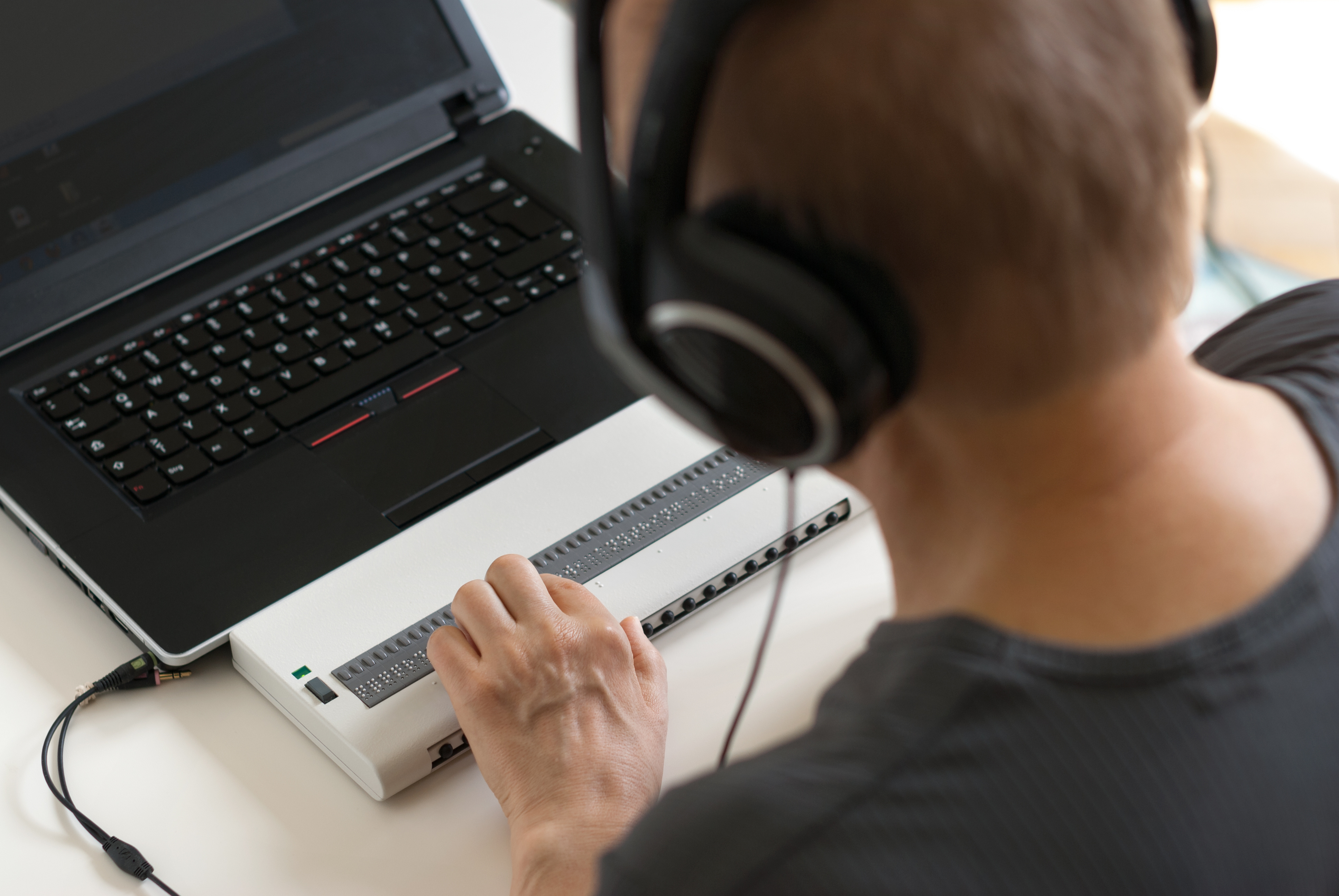
People with disabilities use a variety of tools to access websites. For example, people who are blind or visually impaired typically use screen readers, which are software programs that convert content on a screen into speech or Braille output. Magnification software, which emulates a magnifying glass over the screen, enlarges text and graphics for people who have poor vision or difficulty reading. Speech input software provides an alternate way to enter text and use the computer for those who have difficulty typing. Users tell the software what to click to access a menu item. These products help people easily accomplish tasks online.
Asking New Questions, Conducting an Accessibility Audit
When we recently redesigned our website, we made digital inclusion a priority in the RFP and search process, and followed up by asking questions about contrast levels and ease of navigation throughout our redesign. Our web developer Visceral immediately improved our search functionality and coding compliance with the latest WCAG’s A and AA coding standards.
Second, we added closed captioning to the videos on our website. The many online software options available, such as Rev.com, 3play, and Amara made this simple. We also add closed captioning on our social media videos and urge our partners to do the same. Given the large number of people who view silent videos in their feeds, text overlay on screen graphics ensures broader reach and benefits everyone, not just people with hearing disabilities.
“About 20 percent of the US population has an accessibility issue. That means improving accessibility goes a long way toward extending the reach of the ideas and opportunities we offer to more people.”

Finally, we hired WeCo, an accessibility testing company, to conduct a thorough and independent audit of the redesigned site. What makes WeCo unique is that all of its testers have the disability for which they are testing, enabling them to provide feedback based on their first-hand experience. Other companies may rely on web-based scanners to test for accessibility compliance, an approach that does not check against rules and may find false errors. WeCo’s accessibility experts test a sample of web pages for vision, mobility, and cognitive disabilities and then provide a comprehensive report. They also point out needs that may not have been apparent when the website was constructed and offer specific recommendations to help prioritize accessibility updates.
Here are a few concrete steps we took as a result of this audit:
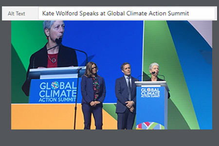
Improve Alt Text: For screen readers, adding alternative text (or alt text) in the backend system provides a description of images. This allows users with visual disabilities to better understand what images look like on a site. We added alt tags to images that did not have them and updated existing tags.
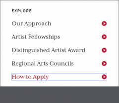
Provide visual focus for keyboard users: This allows keyboard users to use the tab key to navigate through focusable elements, like links, buttons, and form fields. This improves navigation and helps users know where they are on a page.

Add a site map: A site map can help users understand your site structure, provide an overview of your site, and offer an easier way to navigate a site. All users can benefit from a site map to easily find information.
Cleanup of code errors: Code errors can cause assistive devices to misinterpret information on a page. Fixing these errors ensures that assistive technology users can access the information as intended.
To learn more about web accessibility, go to WebAIM, which provides a great introduction, including current coding standards. The World Wide Web Consortium also has a guide that can provide a first review of web accessibility. In addition, the American Disabilities Act has a best practices tool kit available.
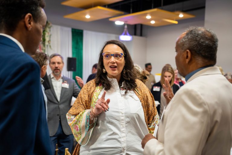
This is a work in progress. As McKnight continues its DEI journey, we will continue to assess how to make our public communication more inclusive. We recognize we have much to learn and can always do better. For example, we aspire to learn more about the inclusive use of language, images, and asset-based framing; increase the diversity of our network of editorial freelancers; and continue to amplify the stories and experiences of under-represented leaders and organizations. We look forward to sharing more of our experiences, especially since we have benefited so much from hearing about the experiences of others.


