This Q&A with McKnight communications director Na Eng was originally published by 5by5 Design and adapted here with permission.
What does “digital-first” mean to you and why is it important?
It used to be that communications departments spent all their resources on a print product and then created a non-user-friendly pdf version to post on the web as an afterthought. Or they produced content for digital platforms using design and editorial decisions as if it were a hard copy print publication. Digital-first to me means the opposite of those approaches. Print certainly still has its place—but increasingly, media outlets and organizations of every kind are recognizing how critical it is to focus on where their audiences spend most of their waking hours. So digital first means creating digital-native content that is fresh and immersive, takes advantage of all the latest tools available, and responds to the highly evolved habits and expectations of modern news consumers. There are also evidence-based technical and design specifications for producing digital content that is more likely to draw in readers and help them retain information.
“Increasingly, media outlets and organizations of every kind are recognizing how critical it is to focus on where their audiences spend most of their waking hours.”—NA ENG, COMMUNICATIONS DIRECTOR
What important lessons have you learned?
Public interest communicators need to devote as much time and creative energy and resources on distribution and outreach as we do on producing creative content. Try clapping with one hand in the air and see if you hear any sounds. You generally need two hands to clap. And yet all too often, we spend all our energy producing a piece of content, and soon after posting it, we’re breathlessly rushing to produce the next piece of content. It’s a tough cycle to break when the demands for content are so high either from internal clients or from the need to “feed the beast” that is our social media platforms. But to me, it’s just not worth the effort to produce anything that doesn’t have a goal and audience in mind right at the point of commissioning. Given that human attention has become one of the scarcest resources, and social media algorithms are constantly changing and one cannot depend on organic reach, it becomes all the more critical to invest in resources on a smart distribution strategy from the onset.
How do you measure what’s working and what’s not?
We certainly look at traditional engagement metrics such as open rates, page views, click through rates, number of followers, shares, and likes, and even heat maps that help us see how long people stayed on a web page, but I’m always more interested in whether content moved people to deeper action. So, we know we’ve succeeded if people actually sign up for a webinar we’ve promoted, or when a thought piece spurs important conversations, or when we hear that a story moved another grantmaker to support an organization or join a coalition. I always appreciate feedback that a resource we offered helped others do their work a little bit faster and more easily because sharing specific, practical insights effectively can accelerate and multiply progress. It’s a much higher bar, but that’s what gets me most excited and makes me feel like we’re making a difference. My philosophy: Aim for outcomes, not just outputs.
What new trends or best-practices have you seen in digital communications?
We’re really pivoting to more visual and human-centered storytelling. We all intuitively know that images can be so powerful. The research tells us time and time again that people are more likely to view and retain visual content at dramatically higher rates than text alone. And our brains our hardwired to think in terms of stories, as opposed to a fire hose of facts alone. So, we spent a long time building up an image database, and we created a new digital storyteller position. Molly Miles, who took on that role, is creating graphic postcards, taking photographs, and editing micro-videos designed for social sharing, and we’re seeing such a positive reaction. They are a lot of fun to produce, and audiences want to be delighted.
What successes have you experienced?
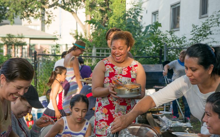
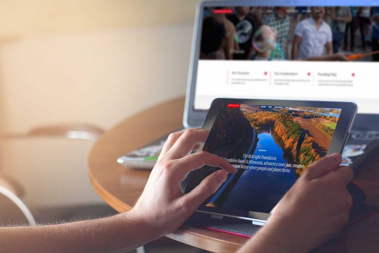
I am really pleased with the way our website redesign turned out. It was a heavy lift as the process required us to review almost every piece of content on our site and ask whether it served our mission. Does the site reflect who we are accurately and tell our story effectively, and does it serve the needs of our visitors? We also had to review the navigation, the functionality, the accessibility level for people with disabilities, and general usability. The results are a much more modern, intuitive site with enhanced features. It uses warm, authentic photographs to draw people in, and to show, not just tell. If you go to the News & Ideas section of the site, it’s quite moving to me to see the faces of all the people who represent McKnight’s mission and work so hard to improve our communities. These are scientists and farmers and entrepreneurs and artists and young leaders and community organizers. We wanted a site that inspires others—so when I see all these diverse change agents and hear their stories, I feel like we succeeded because their stories are so inspiring.


