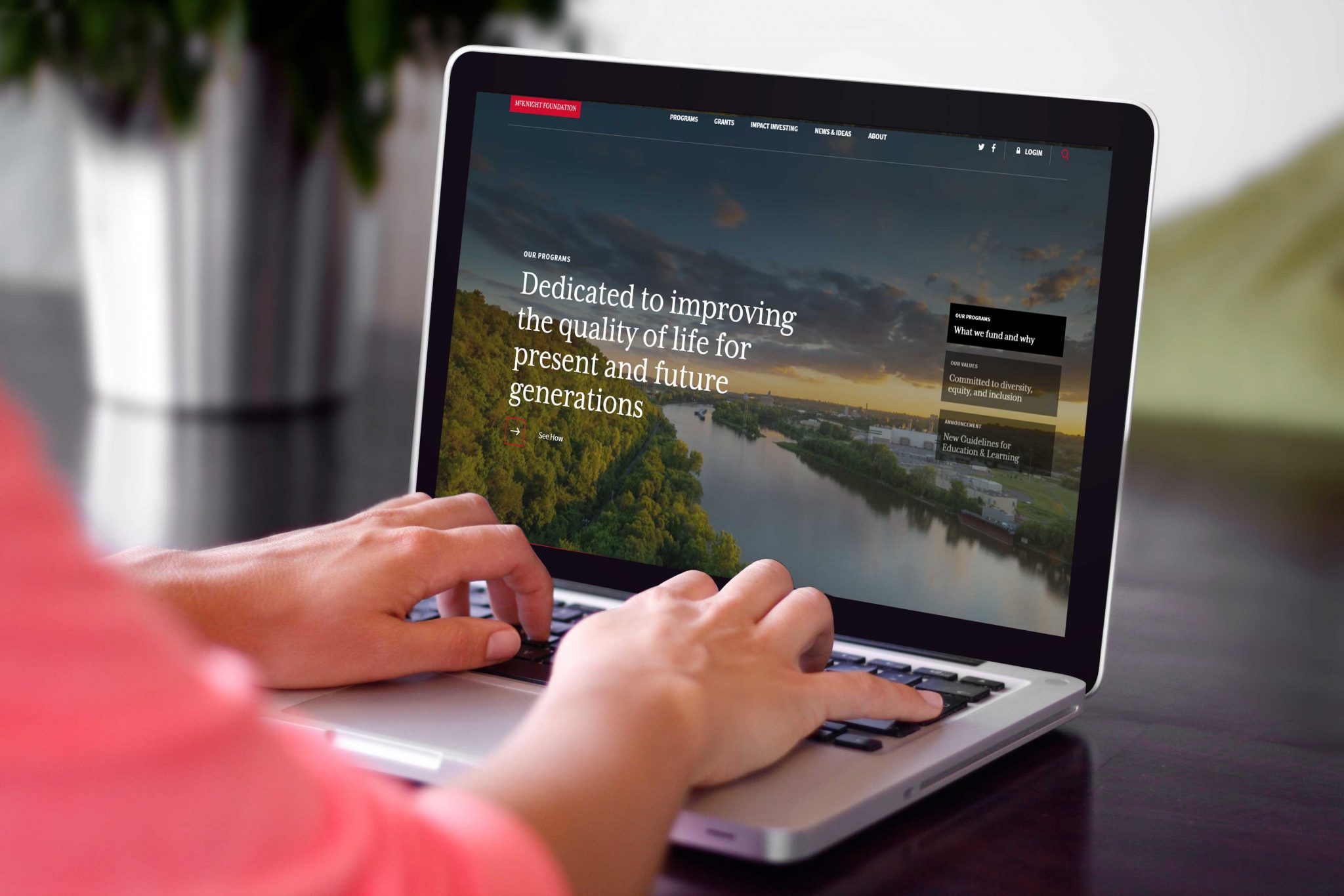
We are thrilled to announce the launch of the new and improved mcknight.org, developed with our partners at Visceral.
From the beginning of this redesign, we focused on a fundamental question: How can our website advance mission and better serve visitors?
You Spoke, We Listened
We are immensely grateful to the more than 350 people who helped us answer this by responding to our survey, and we extend our gratitude to a dozen others who generously offered us counsel through in-depth interviews.
It was heartening to hear how appreciative people were of the transparency on our website, confirming that this is a valued resource.
We also heard many specific suggestions for improvements. Many of you said a foundation needs to do more than inform; it needs to inspire, too. So we added vivid photography and feature stories. We heard a request for greater clarity on what we fund and why, so we took some care in revising detailed descriptions of program goals and application procedures. Many praised the visual and human-centered storytelling in our first entirely digital annual report and expressed a desire to see more of that approach. We agree, and now that’s something our site’s platform can provide.
A Focus on Practical Improvements
Your time is valuable. With the redesign we hope the insights and resources you find will help you do the important work of improving our communities.
Here are just a few enhancements:
Grantseekers can visit a single page that lays out the funding opportunities in all our program areas, including details such as the geographic scope and whether an application process is open or invitation-only.
Grantees can find answers to questions such as how to troubleshoot the online application or how to make requests for a meeting space. And if you’re looking to dive more deeply into a specific program area, you can now see what insights we offer and research we commission related to that program in one central place.
We also discarded content that had long expired and no longer reflected our work. Our friends at IssueLab, a knowledge-sharing hub for the social sector, will have any critical older reports. Feel free to contact the communications team if you’re having trouble finding any archival content.
A New Look for a New Day
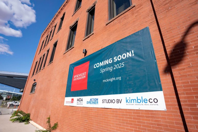
Finally, you may have noticed we’ve given our visual identity a refresh on all our digital platforms. We’ve updated our logo, dropping “The” from our public name. So go ahead and call us the McKnight Foundation, which is how everyone has referred to us anyway. And we’ve chosen a more modern typography style and color palette. The shift is intentionally subtle, staying true to our long tradition as we continue to move forward in the digital age.
Enjoy the site—and come visit us again soon!


